SEEKERS - GRADUATE JOB DISCOVERY APP
Bridging the gap between fresh graduates and real job opportunities
ROLE
Product Designer
EXPERTISE
UX/UI Design
TIMELINE
Sep 2022-Jan 2023

Job Application app and responsive website is a use-friendly, smart and quick job searching mobile application that will provide the best service in Australia. It will help people get their desired job. People can find job circulars in their course of field and can apply very easily. Applicant can get reminder for their interview and give it online. They also get notifications and feedback from recruiters. The entire functionality is kept simple and attractive.
Empathize
53% of graduates from colleges are unemployed across the world. Graduates unemployment rate is one of those topics that we shouldn’t avoid. Students across the US are willing to get into debt to obtain a degree, only to face no job opportunities once they’ve graduated.
Define
Goal:
Design an app that will enable new college graduates have a platform to search and apply for jobs.
Responsibilities:
Conducting interviews, paper and digital wireframing, low and high-fidelity prototyping, conducting usability studies, accounting for accessibility, iterating on designs, determining information architecture, and responsive design.
User Research: Summary
I conducted user interviews, which I then turned into empathy maps to better understand the target user and their needs. Most interview participant which were graduates from colleges or new college graduates from the community haven’t gotten a job or have difficulty in using other platform to apply for jobs. The feedback received through this research made it very clear that the participants would be glad to have a platform in which they could easily apply for jobs without any difficulty.
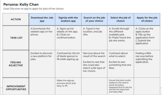
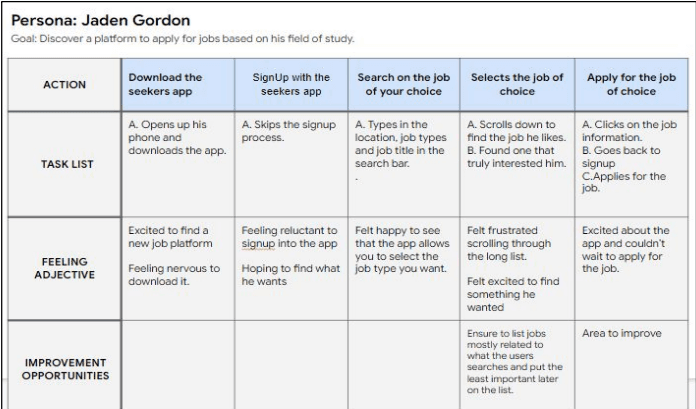
User Journey Map:
Mapping out Kelly Chan's and Jaden Gordon’s user journey map revealed how helpful it would be for users to have access to the Job application app
Ideate
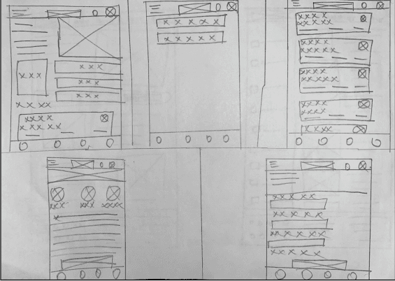
Paper Wireframe
Taking time to draft the iterations of the app and responsive website design on paper ensured that the element that made it to the digital wireframe will be well-suited to address the user pain points.
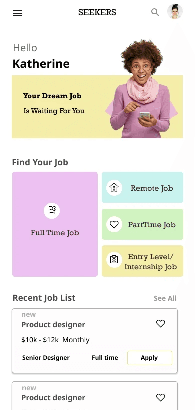
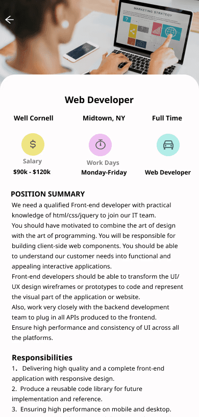
Key Features Designed

Takeaways
Impacts
Our target users shared that the design was intuitive to navigate through, more engaging with the images, and demonstrated a clear visual hierarchy. One quote from the peer feedback was that “the Job application app is very intuitive and it also makes job application process easy”.
What I learned:
I learned that even though the problem I was trying to solve was a big one, diligently going through each step of the design process and aligning with specific user needs helped me come up with solutions that were both feasible and useful.
Accessibility Considerations
Initial focus of the home screen on personalized recommendations help define the primary task or action for the user.
Clear labels for interactive elements that can be read by screen readers.
Identify any additional areas of need and ideate on new features
I used headings with different sized text for clear visual hierarchy
Next Steps
Conduct research on how successful the app is in reaching the goal
Conduct follow-up usability testing on both the app and website.