
Result: 35% improvement in daily active engagement recorded after the redesign launched, driven by reduced cognitive load in the core reflection flow and improved content discoverability.
Goals
Improve UI clarity and structure for both app users and administrators.
Simplify plan sessions management in the dashboard.
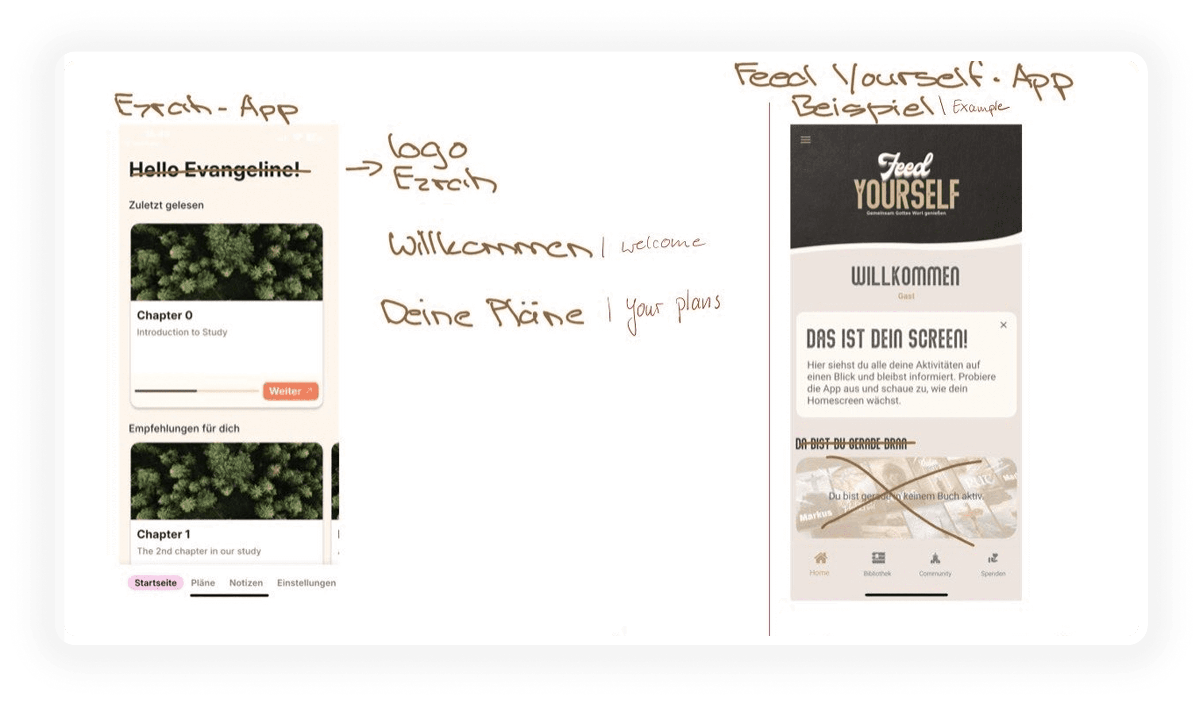
Ensure multilingual accessibility (English, German and Dutch).
Restructure the layout for clearer, more intuitive navigation.
Deliver screens that are developer-friendly and visually consistent.
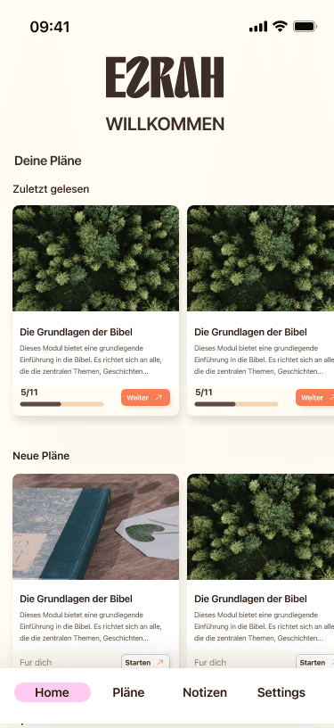
App Redesign (User-Facing)
I was provided with the original app screens in PDF format,
My Task was to redesign selected key user-facing screens for better clarity, usability and structure.
What I Was Given

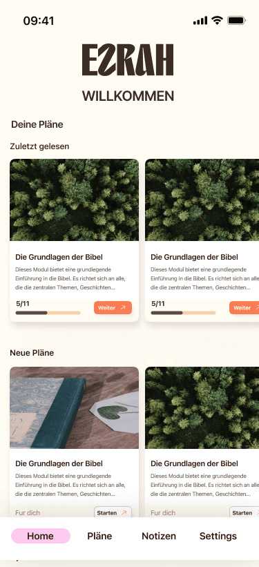
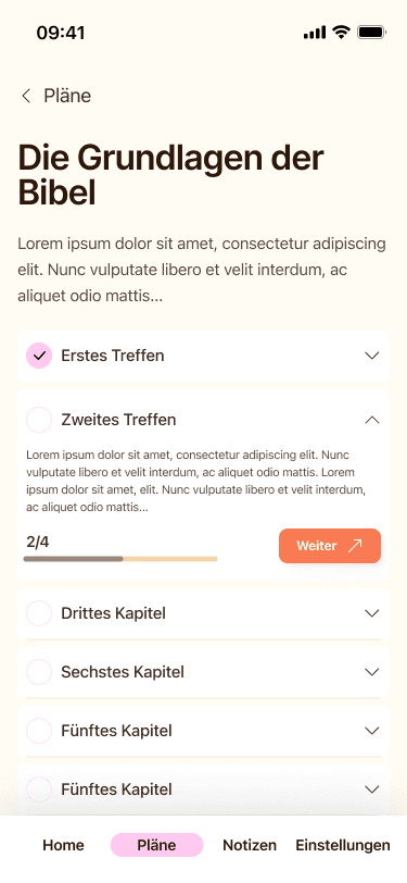
My Redesigns


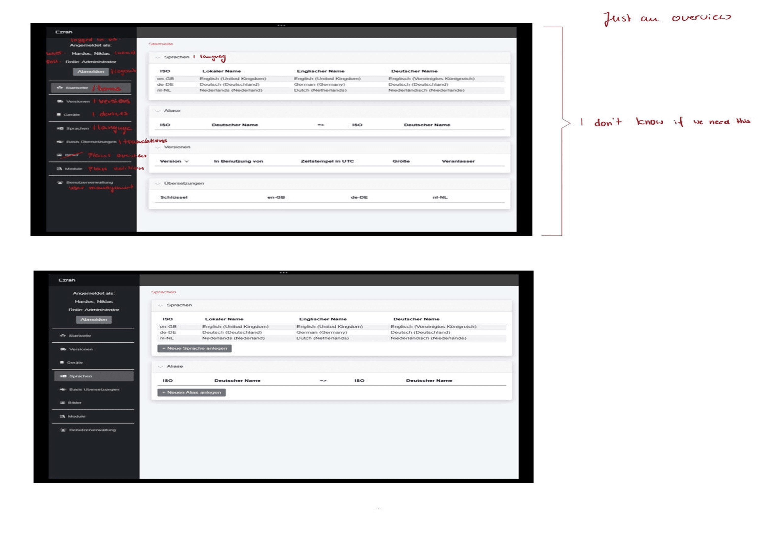
Admin Dashboard Design
Original Admin Dashboard
I was also provided with an outdated version of the admin dashboard.
My goal was to redesign it from scratch with a better structure and user flow.


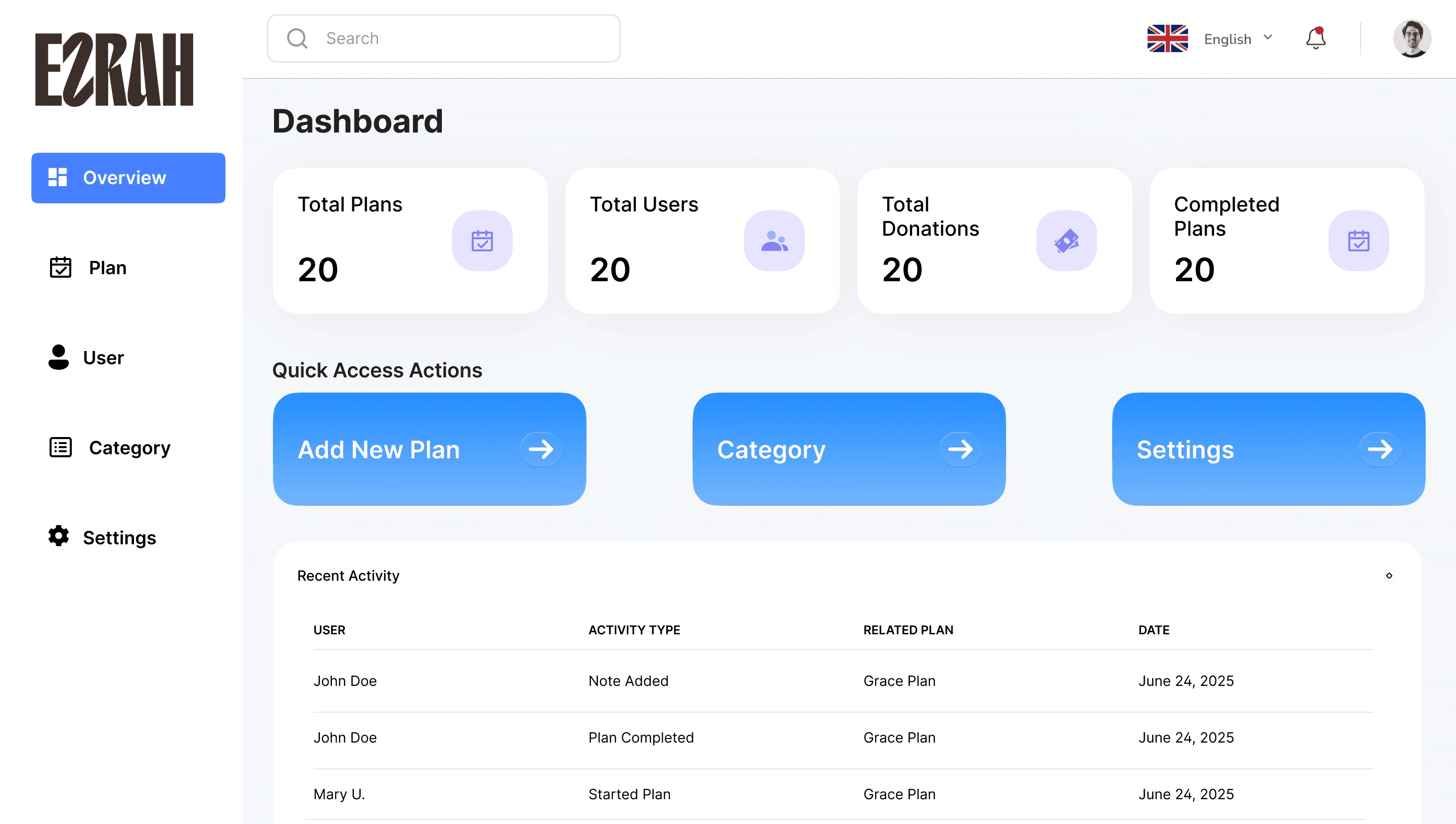
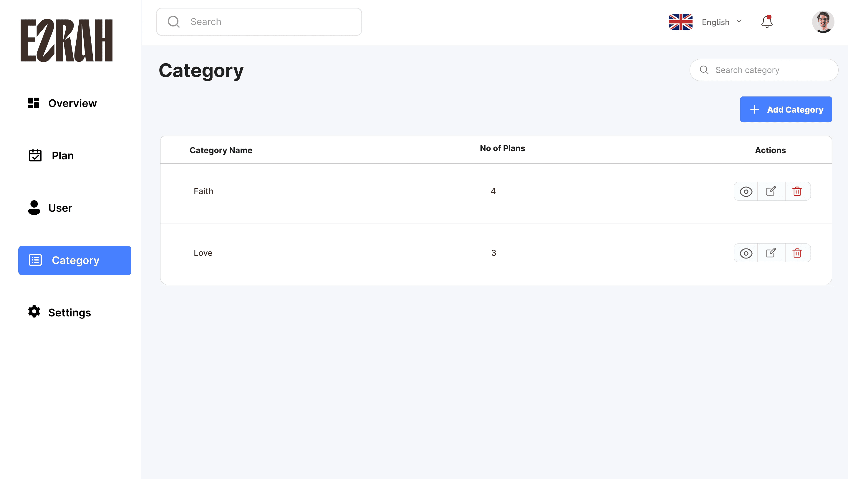
My Admin Dashboard Redesign
I restructured the dashboard into clear sections:
Overview
Plan Management
Categories
Users
Settings


Why I Made These Changes
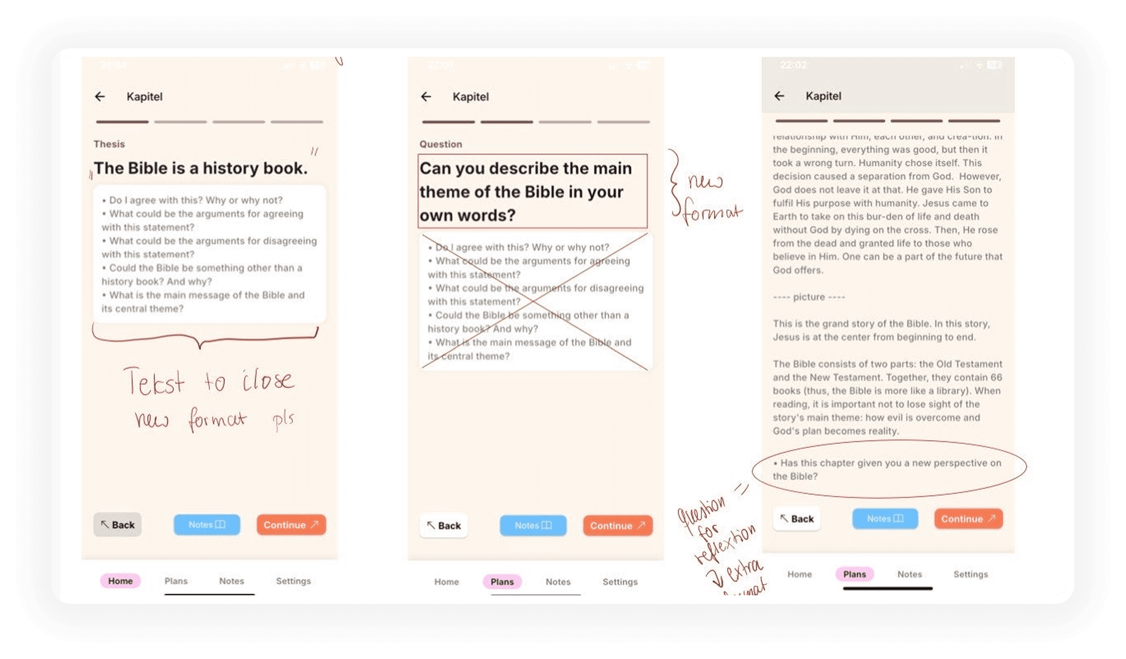
Why I simplified the reflection flow first
1. The original app asked users to make 3–4 decisions before reaching the devotional content, which plan, which session, which language, which day. For a daily habit app, friction at the entry point kills retention. I restructured the flow so returning users land directly on their current session with one tap to continue. New decisions were moved to secondary screens.
Why I redesigned the navigation structure
1. The original bottom navigation had 5 items with inconsistent labelling. Users in the brief noted they weren’t sure where to find their progress or saved plans. I consolidated navigation to 4 items with clearer labels tied to user goals: Today, Plans, Progress, Profile. This reduced the number of taps to reach core content across all three languages.
Why the admin dashboard was rebuilt from scratch
1. The original admin tool was a single-page list with no filtering, no status indicators, and no editing capability without navigating away. The content team was managing a growing library of plans across English, German, and Dutch with no structure. I introduced tabbed sections, inline editing, and a category system, giving the team control without requiring developer involvement for routine content updates.
Outcome
“It looks very good. I love it. I think we are done with the design. I like that you think out of the box and added something useful.”
— CEO, Ezrah
Daily active engagement improved by 35% post-launch. The admin dashboard eliminated the team’s reliance on manual content management and reduced the time to publish new devotional plans.
What I learned
Designing for internationalization (German-first product).
Structuring complex devotional flows into clean UI pattern.
Demonstrating better with non-technical clients.
Reflection
Although i joined mid-way, this product helped me shape the product’s structure where it matters most. I brought clarity to both the app and dashboard, while honoring the app’s spiritual purpose.